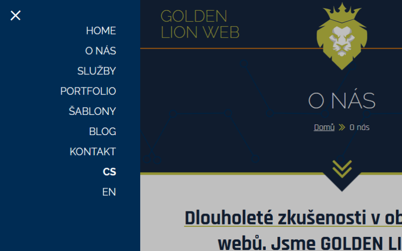
In our series on responsive web design, today we’ll look at how to create a fully functional menu for mobile devices – the kind you’ll find on this website. The menu will behave fully responsively. When you click on the icon, it will move from the left side and move the website content to the right. We’ll achieve this nice effect using CSS animations and JavaScript. Let’s get started.
To understand the code, you need to know HTML, CSS, and JavaScript. We’ll start by creating a menu skeleton in HTML.
<nav id="site-navigation" class="primary-navigation menu" role="navigation">
    <div id="menu-control" class="d-tab-none">
        <a href="javascript:void(0);">
            <span class="menu-control-top-line"></span>
            <span class="menu-control-middle-line"></span>
            <span class="menu-control-bottom-line"></span>
        </a>
    </div>
    <div class="primary-menu-container">
        <ul id="primary-menu" class="menu-wrapper">
            <li class="menu-item"><a href="#">About us</a></li>
            <li class="menu-item"><a href="#">Services</a></li>
            <li class="menu-item"><a href="#">Portfolio</a></li>
            <li class="menu-item"><a href="#">Templates</a></li>
            <li class="menu-item"><a href="#">Blog</a></li>
            <li class="menu-item"><a href="#">Contact</a></li>
        </ul>
    </div>
</nav>
The block with the id “menu-control” is used to control the mobile menu. We add a wrapping div for the entire page with the id “page” to the page layout and nest a div with the class “dark-cover” inside it, which will cover the content when the mobile menu is activated. We also wrap the menu with a header block.
<div id="page" class="site">
    <div class="dark-cover"></div>
    <header>
        <nav id="site-navigation" class="primary-navigation menu" role="navigation">
            ...
        </nav>
     </header>
</div>
We will add basic styles for the menu. We can start with a hamburger button for switching menus. We use the SCSS syntax of the SASS preprocessor.
* {
    box-sizing: border-box;
    margin: 0;
    padding: 0;
}

#menu-control{
   a{
        position: absolute;
        right: 0.75rem;
        width: 44px;
        height: 32px;

        span{
            position: absolute;
            left: 0;
            right: 0;
            height: 2px;
            background-color: #fff;
        }
        &:hover span{
            background-color: #ff0;
        }
    }

    .menu-control-top-line{
        top: 0;
    }
    .menu-control-middle-line{
        top: 15px;
    }
    .menu-control-bottom-line{
        bottom: 0;
    }
}
Let’s continue by adding styles for a responsive menu. We’ll use a media query with breakpoints, setting a boundary of 800px for switching between the mobile and desktop menus.
ul.menu-wrapper{
    padding: 1rem 0;
    list-style-type: none;

    a{
        color: #fff;
        text-align: center;
        width: 100%;
        display: block;
        margin: 1.25rem 0;
        text-transform: uppercase;
        text-decoration: none;
        font-size: 1.5rem;
        padding: 0 2rem;

        &:hover{
            text-decoration: underline;
            text-decoration-color: #ff0;
        }
    }
}
@media (min-width: 480px){
    ul.menu-wrapper{
        padding: 2rem 0 1rem;

        a{
            text-align: right;
            padding: 0 3rem 0 2rem;
            font-size: 1.25rem;
        }
    }
}
@media (min-width: 800px){
    ul.menu-wrapper{
        padding: 0;
        display: flex;
        justify-content: center;

        a{
            font-size: 1rem;
            margin: 0 0.75em;
            padding: 1em 0;
            text-align: left;
            width: auto;

            &:hover{
                color: #ff0;
                text-decoration: none;
            }
        }
    }

    .d-tab-none{
        display: none;
    }
    header{
        min-height: 0;
    }
}
@media (min-width: 1024px){
    ul.menu-wrapper a{
       font-size: 1.25rem;
    }
}
@media (min-width: 1280px){
    ul.menu-wrapper a{
        font-size: 1.5rem;
    }
}
The menu text size gradually increases as the browser window width increases. Now we can add the code for the mobile menu.
.primary-menu-container{
    position: fixed;
    top: 0;
    bottom: 0;
    right: 100%;
    width: 100%;
    transition: right 1s;
    z-index: 110;
    background: #00f;

    @media (min-width: 480px){
        width: 280px;
    }

    @media (min-width: 800px){
        position: static;
        width: 100%;
    }

    &.mobile{
        right: 0;
        overflow-x: auto;

        @media (min-width: 480px){
            right: calc(100% - 280px);
        }
    }

    // close button
    ul.menu-wrapper{
        .close-button{
            width: 2rem;
            display: block;
            margin: 0 auto;
            padding: 0;
            font-size: 5rem;
            font-weight: 200;
            transform: rotate(45deg);
            cursor: pointer;
            color: #fff;

            &:hover{
                color: #ff0;
                text-decoration: none;
            }

            @media (min-width: 480px){
                position: absolute;
                left: 1rem;
                top: -0.5rem;
            }
        }
    }
}
The top part of the code defines the styles for the currently hidden mobile menu, which is activated by clicking the hamburger button. This adds the “mobile” class to the “.primary-menu-container” element. The bolded piece of code takes care of the animation of the menu sliding out from the left. Below in the code are the styles for the close button, which we don’t have in the HTML skeleton, but in the continuation of this series we will create it using JavaScript. From the styles, all that remains is to add the styles for the rest of the page, so that it moves to the right and is covered with a semi-transparent “dark-cover” element.
header{
    background-color: #00f;
    min-height: 4rem;
}
#page{
    background-color: #fff;
    margin-left: 0;
    transition: margin 1s;
    width: 100%;

    .dark-cover{
        display: none;
    }

    &.mobile{
        margin-left: 280px;

        .dark-cover{
            display: block;
            background: rgba(#000000, .25);
            left: 0;
            right: 0;
            top: 0;
            bottom: 0;
            z-index: 100;
            position: fixed;
        }
    }
We have the styles ready, all that remains is to add JavaScript to control the menu, which is the content of the second part of this mini series – Creating a mobile menu (2/2).
Related articles
-
 How to build your own WP theme – Part 2: The Files
 In the previous part, we introduced the basic structure and strengths of WordPress. Today, we’ll follow up on that and show you the basic files that a template must contain. What Files Does a Theme Need? WordPress is quite lenient […]
-
 How to build your own WP theme – Part 1: The Basics
 This is an introductory article on the topic of creating your own templates in the WordPress content management system. In this article, we will introduce this world’s most widely used content management system, discuss its strengths, and show the basic […]