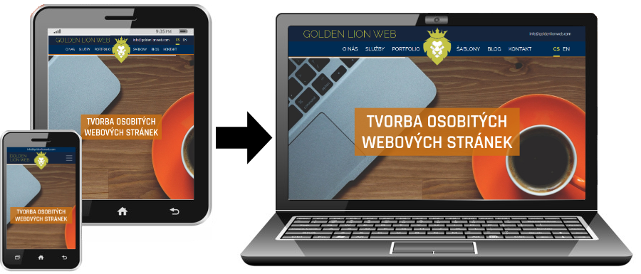
The Mobile First approach is a method of responsive web design that works from the lowest resolution to the highest. The website is coded for mobile devices first. In this article, we will show the advantages of this approach and reveal why it is more advantageous than the Desktop First approach, which works in reverse.
Better Performance
Mobile First means you start with a minimal version of the website and gradually add more complex features for larger screens. This leads to a lighter and faster website because mobile devices only load what they actually need, without unnecessary code meant for desktop.
Simpler and Cleaner Code
When you start from mobile, you have to focus on what’s most important. You write CSS using min-width media queries (not max-width), which is more logical and clearer. You add functionality progressively upward, instead of removing it downward.
Focus on Core Content
Mobile First forces you to prioritize content and features. On a small screen, you simply can’t cram everything in at once, so you have to decide what’s truly important. The result is a cleaner design even on desktop.
Better User Experience on Mobile
Most people today use the web primarily on mobile. When you design from mobile, you ensure that the majority of your users get an optimal experience, instead of getting a “cut-down” desktop version.
Faster Loading on Slow Connections
Mobile users often have slower or more expensive data connections. The Mobile First approach is more considerate of them because they don’t download unnecessary resources meant for larger screens.
Easier Maintenance
When you have a clear hierarchy from simplest to most complex, it’s easier to navigate the code and debug issues. You know the foundation works, and you’re only adding enhancements.
Related articles
-
 How to build your own WP theme – Part 2: The Files
 In the previous part, we introduced the basic structure and strengths of WordPress. Today, we’ll follow up on that and show you the basic files that a template must contain. What Files Does a Theme Need? WordPress is quite lenient […]
-
 How to build your own WP theme – Part 1: The Basics
 This is an introductory article on the topic of creating your own templates in the WordPress content management system. In this article, we will introduce this world’s most widely used content management system, discuss its strengths, and show the basic […]