
5 490 Kč
The Bridges theme is perfect for customers who want to display content beautifully on all devices while still managing to keep their page simple. This page can be divided into sections, each taking up the size of a single screen.
Description
The Bridges template offers all the important features within a single page. The website has a very unique scrolling of content, where you can navigate between individual pages using the mouse wheel. The website is of course fully responsive. Users who visit the site on a mobile device or tablet will lose this scrolling effect, but the website content is still very precisely adjusted to the dimensions of each device.
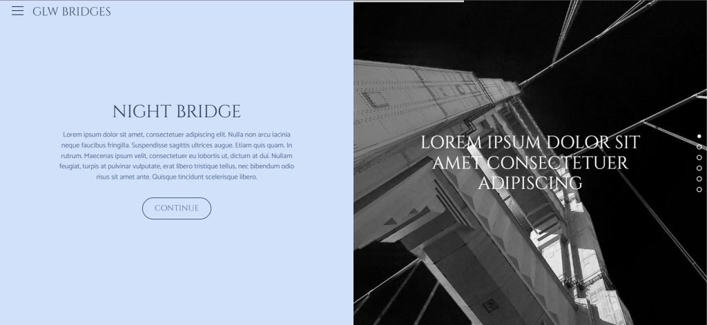
The website consists of individual sections, each of which exactly fills the dimensions of the display device. Half of the window is occupied by a large-scale image, and the second part is space for text content. In the initial window, you can display a slider with several images and slogans. In other sections, you can add, for example, a photo gallery, references, an “About us” page with your photo, or a contact form.
Related products
-
 Golden Lion E-shop
 A template e-shop with a lot of useful features. We believe in our products, which is why we also run our own sites on this template. The template supports multiple languages, so your new e-shop can have a truly global reach.